
Library · Photo Contrast
Text over photographs, tested.
Six strategies, six photos. Four work. Two don’t. The two that don’t are the ones most reached for.
Each demo uses a real CSA photograph at the same headline copy so the
strategy is the only variable. Scroll to compare. The principles
behind the hierarchy are in DESIGN_SYSTEM.md § Photography contrast.

Strategy 2
Democracy starts at home.
Demo 1 · Asymmetric directional gradient
Gradient fades only across the text zone (left third) — 0.78 → 0.02 across the width. The right two-thirds of the photograph show at full strength; the lavender sky and the red roofs still carry their narrative weight. Text legibility comes from the local mask, not from a uniform darken. This is the default for warm-register heroes.

Pillar Three
Strengthen the neighborhoods that decide.
The communities living with the consequences write the rules they live under.
Demo 2 · Text-bound container (parchment band)
The photo is busy throughout — backlit faces, table linens, plates, bunting — there’s no clean text zone to find. Instead of darkening the image to manufacture one, the text sits inside a small opaque parchment container with an ember accent rule. The photo stays at full strength behind it; the container is the contrast device.

From the Working Charter
The communities living with the consequences should write the rules.
Stewardship is moral conviction made operational.
Demo 3 · Text-bound container (hearth chip)
Same strategy as Demo 2 with the inverse aesthetic — a hearth-navy chip with linen type, ember accent rule. Useful when the photo’s warm tones would clash with a parchment band, or when the editorial moment wants gravitas. The photograph still reads in full at the right.
Strategy 4
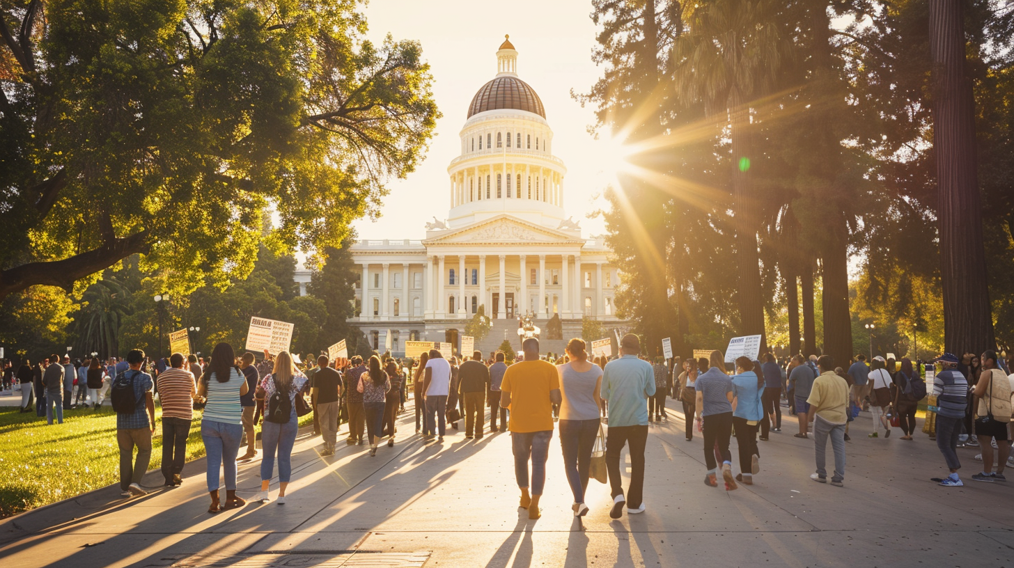
The argument lives in the next room.
The photo above carries no text. It is a full-bleed image of the capitol building, doing its own work. The headline lives below it on a solid linen ground where legibility is guaranteed and typography can be set without contrast compromise.
Demo 4 · Off-image text (the magazine pattern)
The most disciplined option. The photograph is sovereign, the headline is sovereign — they meet in space, not in pixels. Use for editorial layouts where image and text don’t need to coexist visually. The loss is drama; the gain is photograph integrity and typographic freedom.
Anti-pattern · A
What we used on the legacy CSA Squarespace site. What we should not use again.

Practical, Place-Based
Solutions as unique as the communities they serve.
❌ Anti-pattern · Uniform dark overlay
Text reads cleanly, but the photograph is destroyed — a roadside sign in a California landscape becomes atmospheric wallpaper. The photo’s narrative work (place, weather, season, time-of-day) is gone. Compare to Demo 1 where the same legibility goal is met without sacrificing the right two-thirds of the image. Never use a uniform overlay above 0.4 opacity.
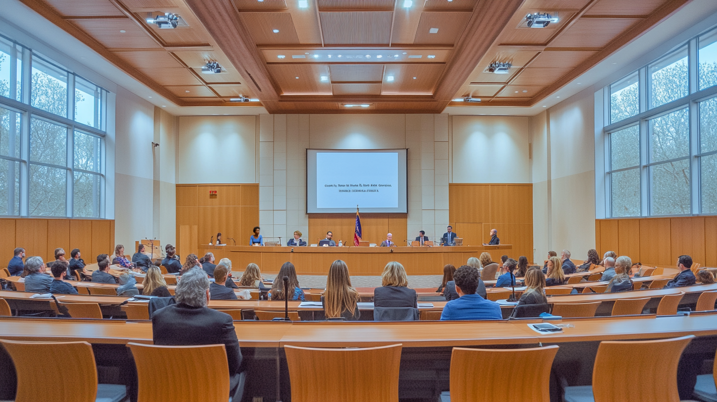
City Government
Equip the cities that govern.
❌ Anti-pattern · Text-shadow
Each glyph carries a heavy drop shadow to manufacture contrast against whatever pixels happen to sit behind it. The result reads as 1990s web design — a tell that the layout couldn’t be solved typographically and was rescued in CSS. There is no editorial system in which text-shadow on display headlines reads as polished. Never.
The Hierarchy
Photo first. Local mask second. Container third.
Use, in order
- Photo selection — choose photos with text-safe zones
- Asymmetric directional gradient — local, max 0.6 → 0.05 (Demo 1)
- Text-bound container — parchment band or hearth chip (Demos 2, 3)
- Off-image text — full-bleed photo, headline below (Demo 4)
- Typographic mass — display 7xl Roman bold, with 1 or 2
Never
- Uniform dark overlay > 0.4 opacity — destroys the photograph
- Text-shadow on display headlines — reads as amateur
- Tiny labels directly over photography — no strategy rescues 12px
Most-leveraged move: (1) photo selection. The brand should commission or curate photographs with text-zone structure as a design constraint, not a content afterthought.