


Pillar 1 of 5
Build an Enduring Movement.
Local Stewardship Chapters building the coordinated, neighbor-to-neighbor presence that turns community values into durable political force.
Learn moreDesign Library
Warm narrative for the front porch. Institutional document for the ballot. Same DNA — wordmark, palette, type, italic-ember accent — applied with discipline.
This page renders every component once, with placeholder content. It is the visual companion to DESIGN_SYSTEM.md. If a design choice can’t be defended against the principles there, it’s a band-aid.
Part I — The DNA Layer
Wordmark, palette, type stack, signature italic-ember accent, eyebrow vocabulary, button system, gradient hairlines. Never bypass.
Same seal, same Cormorant SC name, same ember domain pattern. The two sites are sub-brands of one parent identity. Inverted on dark grounds.
hearth
#1A2438
ember
#C49A28
linen
#F5EFE2
parchment
#EDE4CF
walnut
#3A2E1E
Display · Playfair Display 700
Democracy starts at home.
Eyebrow · Cormorant SC small caps + flanking gold hairlines
California Stewardship Alliance
Body · EB Garamond 17px / 1.7
California Stewardship Alliance is a statewide alliance dedicated to advancing practical, place-based housing solutions. We believe durable housing policy emerges when communities are empowered to shape growth in ways that reflect their infrastructure, economy, and character.
UI · Source Sans 3 tracked uppercase
Read the argument · Stay informed · Get involved
Part II — Warm Register
Linen + parchment grounds. Photography is structural — never decorative. Generous breathing room. First-person plural voice. Long-form welcome. Real towns, real names, real dates.
Hosts: /, /vision, all five pillar pages, articles, donate, membership.
Component · WarmHero
Tier 1 — natural contrast · focalPoint default · photo is foreground

California Stewardship Alliance
Because the best decisions are made by the people who live with them.
Component · WarmHero
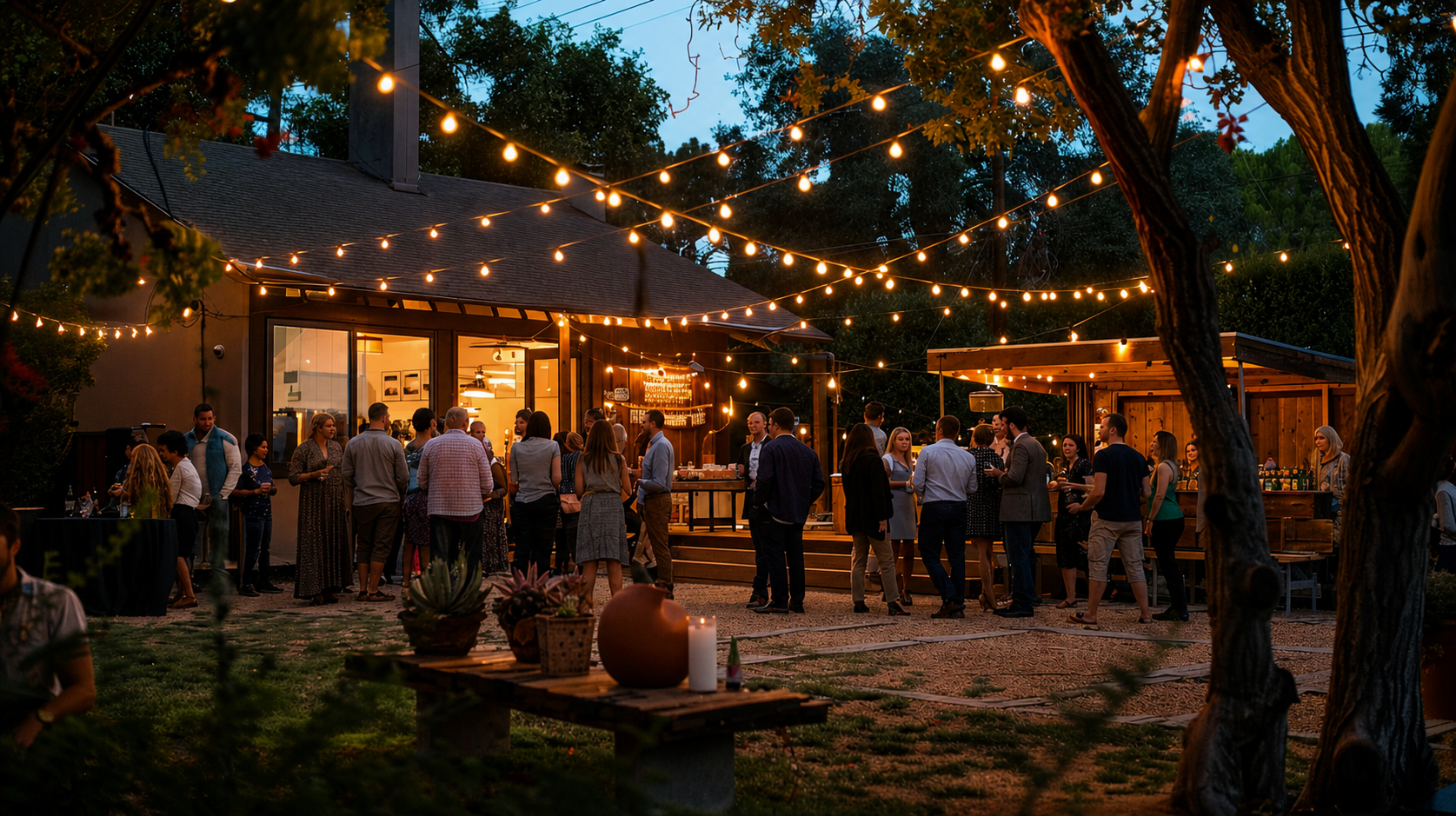
Tier 2 — warm text plate · use when photo's text zone is bright · textPlate prop
California Stewardship Alliance
Communities that plan their own future build something worth protecting.
WarmHero · contrast system
Tier 1 (default) — Photo's bottom-left zone is architecturally quiet. Corner-vignette scrim + focalPoint bias + invisible text-shadow. No props needed.
Tier 2 (textPlate) — Photo fights the type zone. Add textPlate prop: frosted-glass panel (hearth tint + backdrop blur). The photo shows through the blur rather than being buried.
Tier 3 (art direction) — Text zone is fundamentally wrong (sky, flare, white stucco in the bottom-left). Adjust focalPoint, crop, or choose a different photo. No CSS prop belongs here.
The quiet-zone test: mentally apply a 30% dark overlay to the bottom-left third. If the composition's soul is there, the photo will fight the type — choose another.
Component · PillarRow
The primary /vision component. Full-width 50/50 split — full-bleed photo
on one side, text panel on the other. Alternates image-left / image-right on odd / even rows.
Ghost numeral anchors the text column. Mobile: image stacks above text.
Pillar 1 of 5
Local Stewardship Chapters building the coordinated, neighbor-to-neighbor presence that turns community values into durable political force.
Learn more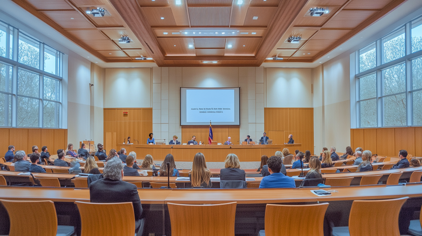
Pillar 2 of 5
Legal tools, policy briefs, and knowledge so elected officials govern confidently — requiring safety and infrastructure standards isn't obstruction.
Learn more Pillar 3 of 5
Strategic capital tied to strategy, not crises — invested in tools, research, and legal analysis that compound in value over time.
Learn more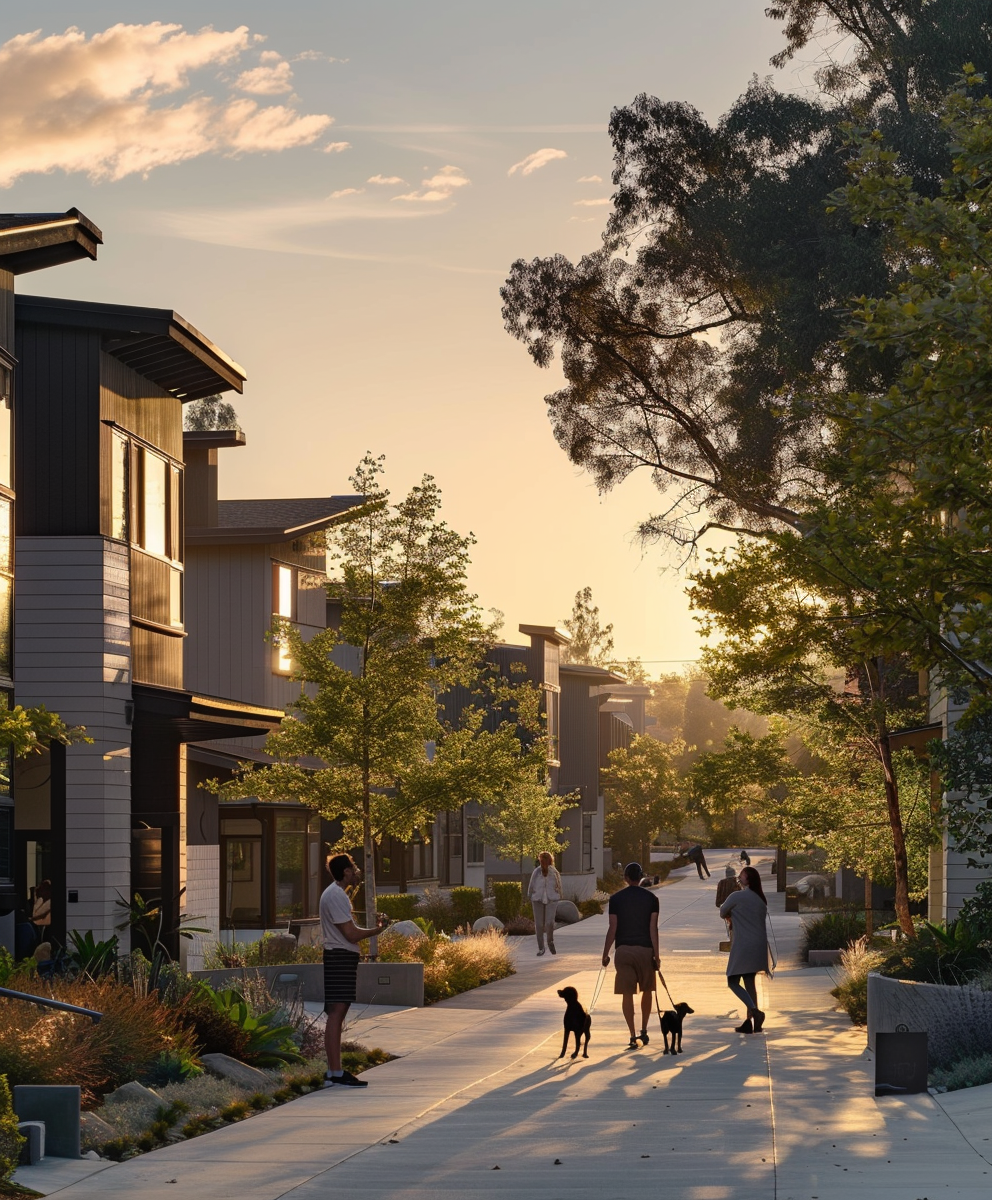
Pillar 4 of 5
Redirect investment by realigning housing economics — so the most profitable development jobs benefit the communities they're built for.
Learn more
Pillar 5 of 5
The Balanced Housing Growth Management Act: Sacramento must measure infrastructure capacity and fund growth before mandating it.
Learn moreComponent · PillarCard
Use for article previews, related content, or any three-up grid outside of /vision.
Not for the vision page — use PillarRow there.
Pillar 1
Local Stewardship Chapters building the coordinated, neighbor-to-neighbor presence that turns community values into durable political force.
Learn more Pillar 2
Legal tools, policy briefs, and knowledge so elected officials govern confidently — requiring safety and infrastructure standards isn't obstruction.
Learn more Pillar 3
Strategic capital tied to strategy, not crises — invested in tools, research, and legal analysis that compound in value over time.
Learn moreComponent · Testimony
We knew which streets could absorb growth and which couldn't. The state never asked. CSA gave us the legal framework to push back.
Component · PullPassage (linen variant)
A housing policy that works in San Francisco does not work in Sonora. The state's job is to set the floor, not to draft the floor plan.
Component · PlaceMarker
An inline place + date stamp. Use after a section that makes a place-grounded claim, so the claim is visibly tied to a specific town and time.
When the council voted unanimously to amend the local housing element, the state's first response was a letter from Sacramento warning of withheld funds. The second response, a year later, was a quiet acknowledgement that the amended element had outperformed the state’s own targets.
Healdsburg, CA · 2024Component · PillarFooterCTA — warm closing brand moment
California Stewardship Alliance
Democracy starts at home.
californiastewardship.org
Ghosted seal (mix-blend-multiply at 7% opacity) reads as a linen watermark impression — not a faded image. eyebrow-flanked on linen surface: ember text + ember hairlines. rule-vertical descent. Playfair italic tagline with Roman-ember accent. Domain subline in Source Sans 3 tracked uppercase.
Part III — Institutional Register
Hearth-navy panels and white paper-surfaces. Numbered structure. Comparison grids. Citations. Declarative voice. Photography rare and document-textured. Hosts: balancedhousing.org and any pure-policy page on CSA.
A guest in CSA pages, never the host. A pillar page may include one ContrastGrid or HowItWorksTimeline; it always closes warm.
Component · ConvictionPanel (light variant)
The First Principle
For the first time, Sacramento puts its money on the table before issuing a mandate. Infrastructure funded. Capacity created. Investment made. Then — and only then — does growth follow. That's not a regulation. That's leadership.
A State that invests before it asks earns the right to lead.
Component · ConvictionPanel (dark variant)
The Second Principle
Cities measure their own carrying capacity using engineering standards — not political targets. Buildable land, evacuation routes, water, sewer, schools, energy. The state then plans against what is physically possible, not what is politically convenient.
The communities living with the consequences should write the rules they live under.
Component · HowItWorksTimeline
The Mechanism
Numbered ember circles connected by a vertical gold gradient line. Step name in tracked Source Sans 3, description in EB Garamond walnut-md.
Build the alliance of cities, advocacy groups, and voters.
Draft and qualify the constitutional initiative.
Voters approve protections for local land-use authority.
Repeal or amend conflicting state mandates.
Component · ContrastGrid
The Difference
Two paper-surface columns. The 'after' column gets an ember border to mark the brand's preferred state.
No new taxes · No override of local zoning · Constitutional protection for democratic decision-making
Component · EvidencePanel
The Argument
Generic document-register wrapper. Pure white surface with a parchment border. Use when the content is evidence, citation, or argument that needs a different ground than the surrounding warm narrative — but doesn't fit one of the more specific institutional components.
Component · PullPassage (hearth variant — usable on either register)
Capacity before growth. Investment before mandate. Stewardship before extraction.
Part IV — Composition Templates
Three reference compositions. Most CSA pages follow Template B; pure-policy pages follow Template C. Template A is the home / vision pattern.
Template A · Warm Host
Used by: /, /vision
Template B · Warm + Inset
Used by: the five pillar pages
Template C · Institutional
Used by: balancedhousing.org, future /policy/*
Part V — Donation UI
The DonationWidget handles frequency toggling, preset + custom amounts, and Stripe Checkout redirect. No framework dependency — vanilla JS with data- attribute state hooks.
Component · DonationWidget
Secure payment via Stripe — no account required
Frequency toggle
Pill tabs. Selected state driven by aria-pressed="true" — styled with CSS attribute selector, no JS class manipulation.
Amount presets
4-col grid. Selected state: data-selected attribute → border-ember bg-ember/[0.08]. Selecting a preset clears the custom input.
Custom input
Dollar-sign prefix via absolute positioning. Typing deselects all presets. Empty or invalid revert to last preset.
CTA label
Dynamic: Donate $50 / Donate $50/mo. On click: disables, shows "Redirecting…", POSTs to /api/create-checkout-session, follows returned URL. Re-enables silently on error.
Props
defaultAmount? — preset selected on load (default 50). class? — forwarded to wrapper div for surface / padding overrides.
Part VI — Navigation
Four audience segments — Lawmakers, Cities, Advocacy Groups, Business Leaders — each a dropdown parent whose top-level link goes directly to the section landing page. Sub-items mix graphic .astro pillar pages with future markdown content. Desktop: hover panel with transparent bridge zone. Mobile: chevron-gated accordion.
To add a new sub-page: append an entry to the items array for the relevant audience in Nav.astro. The description field is optional — omit it for short utility links.
Chevron — rotates 180° when open; inherits ember color from the active nav-link state.
Transparent bridge — the dropdown wrapper has pt-2 padding above the panel so the hover region extends to cover the gap; the mouse never leaves the hover zone.
Active item — ember left border + parchment background. Inactive items get the border on hover only.
Keyboard — group-focus-within keeps the panel open when focus moves inside it via Tab.
Split affordance — the audience label is a direct link to the section landing page; the chevron button is a separate tap target that expands sub-items. Neither action blocks the other.
Sub-list indent — pl-4 border-l-2 border-parchment-dk matches the brand's vertical rule language without introducing a new pattern.
End of Library
Read DESIGN_SYSTEM.md for the principles. Read this page for the components. Build to both — not to whichever reference site happens to be open.